Knyts
Identity • Experience • Interface • Prototyping
Knyts – Streetwear E-commerce Retail Site
Knyts is a streetwear clothing store started in 1994 with more than 400 physical stores worldwide. Their target audience is people of all ages who care about affordable yet decent quality clothing. With COVID-19, many of their stores were affected and the company is looking to transition their successful business online to make it accessible for all their users.
My role as a UX Designer was to understand what about the ideal online shopping experience makes it so compelling to users and what features or tools are important so that we can incorporate them into Knyts digital presence.
Solution & Results
A responsive online store to increase their base market, mimic the in store shopping experience, and easily find sustainable clothes and relevant information needed (size, fit, reviews) to build their confidence that they are making the correct purchase.

Research - Analyzing the Problem Space
In order to understand the current scope of Knyts particular market, it was imperative that we conduct both secondary research on the e-commerce retail fashion space, competitive analysis of their digital/physical competitors, and one on one user interviews of frequent online shoppers and target audience to accomplish the following:
- Determine what aspects of an online store are the most helpful and important to users
- Understand what the average online shopper needs and wants out of their experience
- Comprehend the user flow of an average shopper and mitigate any confusion
- Analyze if there are any affordances from the in-person shopping experience that can be easily translate online

Resulting data from Secondary Research on the E-commerce retail space as well as an analysis of Knyts’ competitors
Define - Creating a Seamless Shopping Experience
To keep our process user-focused, I articulated Problem Statements and How Might We questions (HMW) based on the user research conducted. We crafted an ideal persona, Joshua, to encapsulate our target audience, typically a fashion-forward young urban professional in a major city. Following a series of research sessions against Joshua-like users we found three key issues:
- How might we help Joshua find quality pants that fit him perfectly?
- How might we assist Joshua in his discovery of the latest trendy clothes?
- How might we make the shopping process seamless and intuitive for Joshua?

Persona Analysis and Empathy Map for Joshua were created to envision our target audience for Knyts.
Information Architecture
Using these guiding questions, we were able to narrow down the key features that we wanted to create a seamless online shopping experience.
- Ease of Navigation
- Curating high quality visuals, sizing, and sustainability details
- Focusing on crafting an intuitive checkout process

Ideate - Simplifying the Checkout Process
We constructed a user flow in advance to help visualize the structure of the design to both the business and myself while understanding the user’s actions and decisions points as they complete a task. This also represents the number of screens that a user may encounter when completing that task.
A user can go about discovering clothes through two main entry points:
1. Search bar
2. Categorical Exploration
Both ways eventually lead users to a streamlined checkout process of requiring size, color, payment, and shipping details before placing the order.

Build - Wireframing & Brand Identity
Since we detailed a user journey with multiple pathways before creating a prototype, constructing mid-fidelity wireframes of the user process became a lot more straightforward to design. These wireframes provided a larger scope of the digital architecture for our stakeholders on both the business and user end to understand/critique before moving onto the high-fidelity prototypes.

Mid-fidelity wireframes of the main base shopping experience screens.

Logo and Style Tile
The style tile displayed here gives a visual representation of Knyts. I wanted to bring out themes I gathered from Knyts: clean, modern, trendy, and memorable style. From that, I developed a minimalistic design with eye-catching tones to emulate the urban and streetwear theme. The logo and orange and purple palette represent both bold and trendy motifs while still having a sophisticated edge. Furthermore, the logo and selected typefaces allowed for flexibility in color contrast and symbolic memorability.

Responsive Design
Since our goal was to make the Knyts shopping platform as accessible as possible, it was imperative that we made the e-commerce site also responsive to both phone and tablet devices so that shopper's can access it anytime and anywhere. Demonstrated here is the homepage of the site if it was displayed on a mobile iphone.
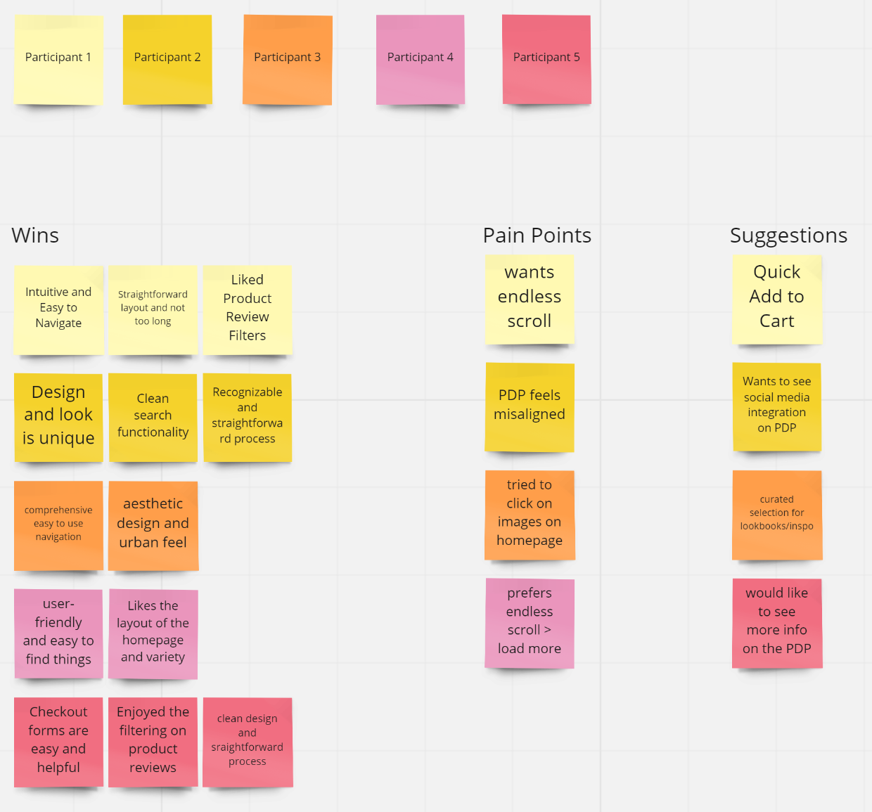
Testing - Revisions & Reflections
Once I had my high-fidelity prototype working, I recruited 5 participants to test the prototype and observe how they completed each task. From the results and notes I gathered I created an affinity map to prioritize revisions and discover common patterns and pain points. From the affinity map we were able to discover and improve the following revisions:
- Misaligned details on the Product Detail Page
- Add Endless Scroll to Product Results Page
- Build in Quick Add to Cart button

Final High Fidelity UI Screen Process Flow demonstrating the final Checkout Process from the Catalog Search Task Flow
Key Takeaways & Future Plans
This project helped me understand the value of user research and how to conduct research to meet our specific objectives. I also learned how to incorporate this data throughout the duration of the project to justify data-driven design decisions and optimize for the best user experience.
After implementing changes to alleviate original pain points, I will need to conduct further usability testing and research to uncover additional pain points and make more easy to navigate paths for different tasks. Specifically, I will need to conduct A/B testing to see if users are more familiar with a heart icon or bookmark icon to save items for later.
Future improvements include looking at the conversion metrics to see if the new launch of Knyts’ e-commerce website and re-branding brought in more revenue at the end of a given quarter.
© Camille Nibungco 2021