Gay City – Seattle's LGBTQ+ Community Center
Research • Identity • Interaction
Gay City – Seattle's LGBTQ+ Community Health Center
Gay City is Seattle's definitive hub for LGBTQ individuals seeking affirming and responsive resources, wellness, and community and is the leading HIV/STI tester in King County, home to several LGBTQ-affirming services, and provides access to several diverse resources. As a queer person living in Seattle, I chose to assist Gay City due to their locality, unique place at the intersection of building queer and health education and services, and alignment of my values with theirs.
I took on a pro-bono UX Design role in this 2 week design sprint to design a responsive website to inform users of Gay City's resources and help them book healthcare appointments seamlessly.
Solution & Result
As a local non-profit as the website stands today, it has been long due for a revamping and has mainly been concerned with staying functional leading to a variety of user experience and overall design issues. Their main online services of informing the general public of community resources and making STI appointments were in need of a redesign.
Research - Analyzing the Problem Space
In order to understand how Gay City can become accessible and user friendly to all audiences and what features or services are important so that we can streamline Gay City’s digital presence. I utilized a variety of user research methodologies including secondary research of LGBTQ+ community centers of major cities, existing site analytics, community mailing surveys, and one on one interviews to:
- Determine what online services of Gay City are the most helpful and important to users
- Understand what information the average user looks for when navigating Gay City
- Understand the user flow of Gay City’s scheduling services and mitigate any confusion
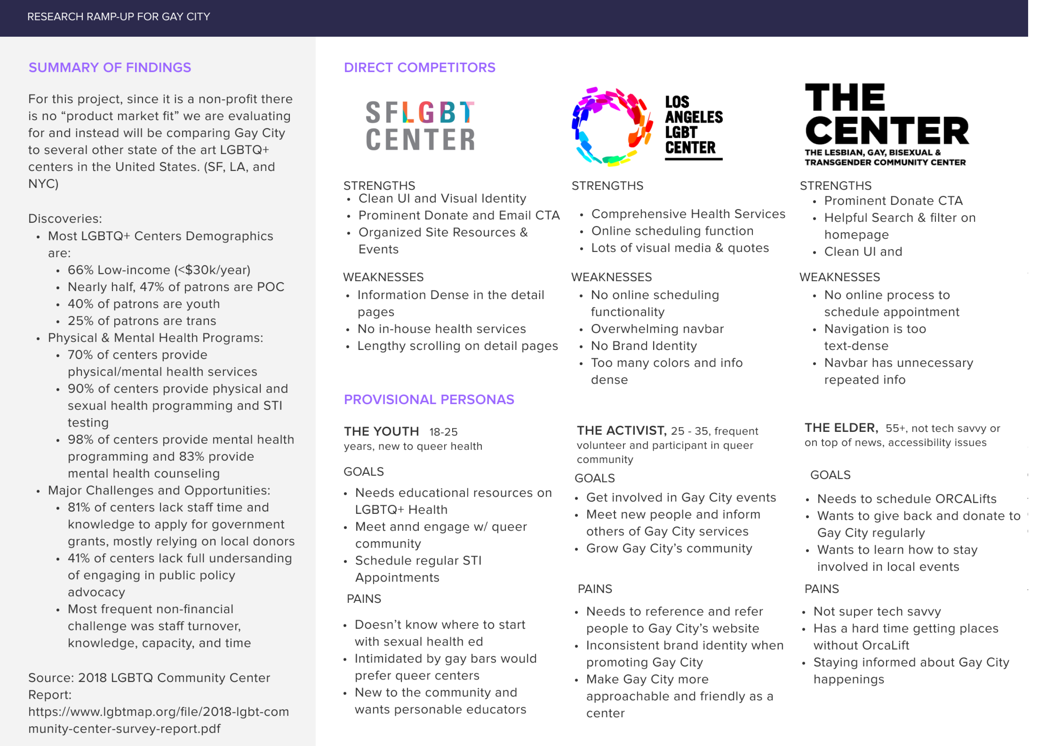
Resulting data from Secondary Research on the LGBTQ+ community centers in major U.S. cities
Define - Identifying the Scenario
Using our findings from our user research, I crafted a persona, Sam, a young LGBTQ-identifying individual seeking local resources from the center. To keep features user-centered, I articulated Problem Statements and How Might We questions (HMW) based on the research using our persona.
- How might we inform Sam about Gay City's mission?
- How might we make STI appointment scheduling easy and less intimidating for first time users like Sam?
- How might we make Gay City's mission and values come across through their digital presence?
Ideate - Simplifying the Process
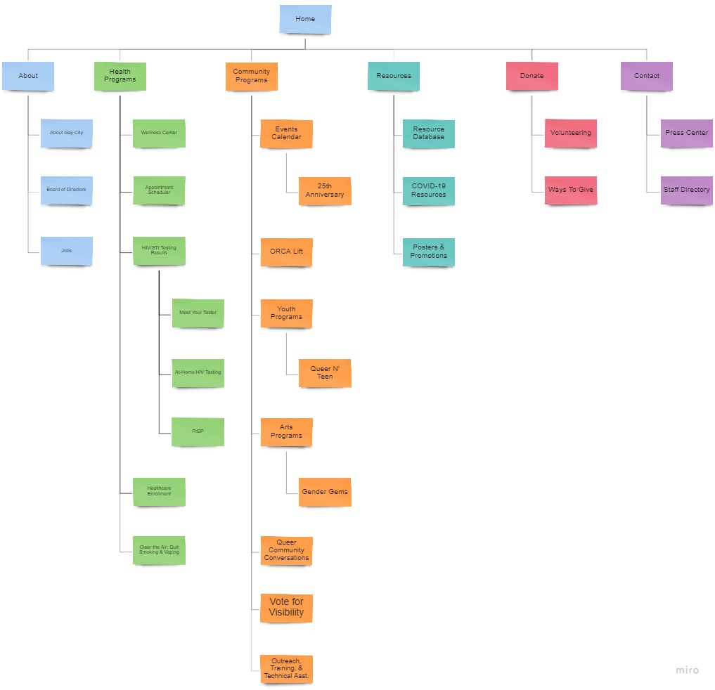
To solve for the first pain point of navigational issues, I conducted an open card sort to comprehend how most user’s would group together various categories from the list of Gay City’s current resources. An easy to navigate website did not only benefit users, it also would be highly beneficial to Gay City to serve their community. From the results, I was able to synthesize the site map using Miro which acted as our base foundation for the website as pictured below.
Build - Wireframing & Brand Identity
Since we detailed a user journey with multiple pathways before creating a prototype, constructing mid-fidelity wireframes of the user process became a lot more straightforward to design. These wireframes provided a larger scope of the digital architecture for our stakeholders on both the business and user end to understand/critique before moving onto the high-fidelity prototypes.

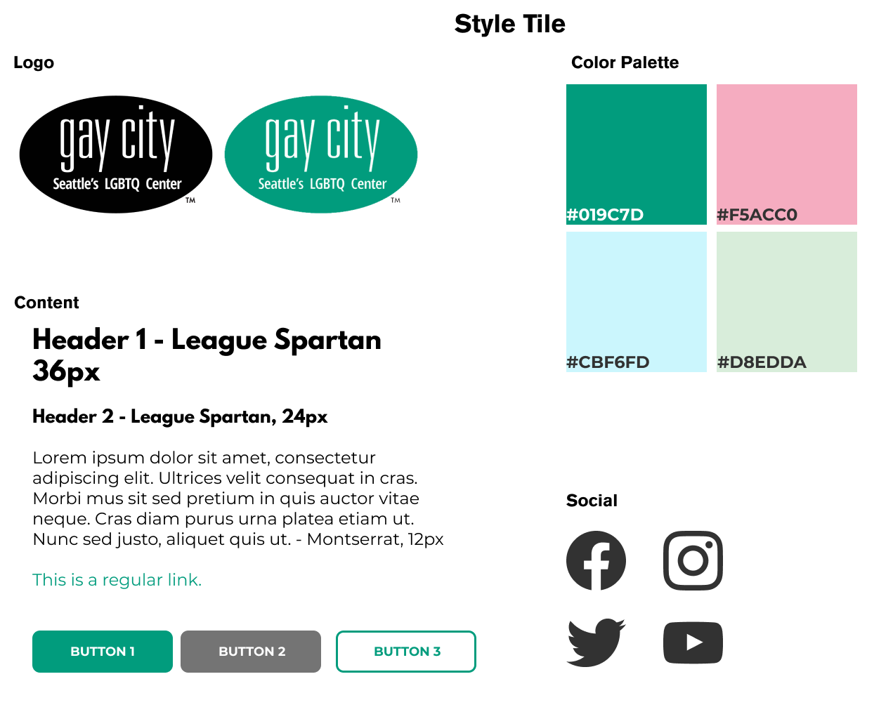
Logo & Style Tile
I wanted to bring out themes I gathered from Gay City: cultivating access and connections to promote self-determination, liberation and joy in our communities. They previously used a heavy shade of green to emphasize these values and bring a health-focused impact to the community. So I to stay aligned with the color green, I introduced various shades of a more joyful green complimented by the trans pride flag colors to represent that largest demographic that they serve. The newly created style tile not only gives a better visual representation of Gay City’s approachable and personable role as a community center but also strengthens their core motif as a positive place for health and resources.
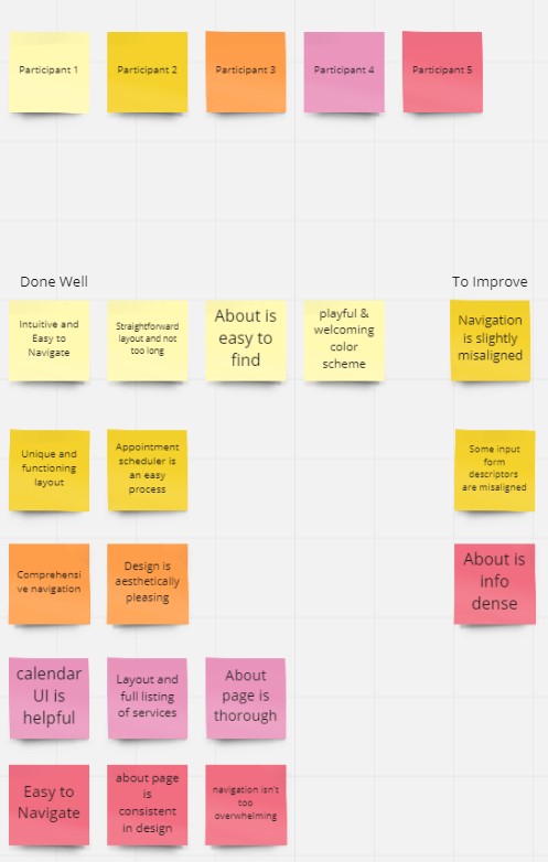
Testing - Revisions & Reflections
Once I had my high-fidelity prototype working, I recruited 5 participants to test the prototype and observe how they completed each task. From the results and notes I gathered I created an affinity map to prioritize revisions and discover common patterns and pain points. From the affinity map we were able to discover and improve the following revisions:
- Misaligned details on the Navigation
- Input Form Descriptors Misaligned
- Reducing info density on the About page
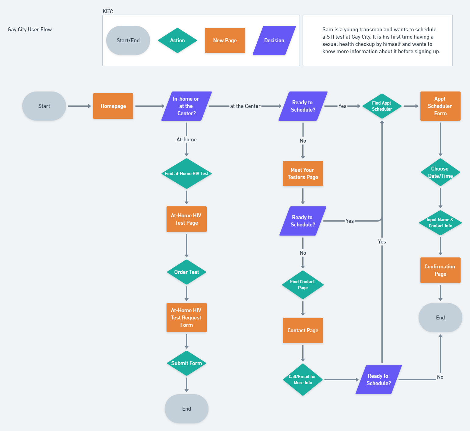
Appointment Scheduler Flow
As Gay City is King County’s largest distributor for HIV/STI Testing, booking appointments online is an essential feature to their online services. Additionally, their key demographics that use their services are trans-identifying youth, so staying approachable and personable was a key factor in redesigning this process flow. Demonstrated is the main appointment scheduler flow.

Final Hi-Fidelity UI Screens for the Appointment Scheduler Process
Key Takeaways & Future Plans
I managed to take Gay City's current status as a local community resource and incorporate it's mission and values into a more aligned vision. It also taught me the importance of collaboration with a client and how to work within the constraints set forth by them while still introducing my own vision and work as a UX designer.
Our collaborative work led to improved time and cost savings and reduced employee workloads. With the client, we were able to come together to create a better product and streamlined process for making appointments online. Future improvements also include adding a community events page, resources list, and meet your testers feature to help users feel more acquainted and comfortable with the community center's services.
© Camille Nibungco 2021