Everout
Research • Experience • Prototyping
Everout - Native iOS Event Discovery Mobile Application
Founded by the same people behind the popular events calendars at The Stranger and the Portland Mercury, EverOut is your one-stop shop to find out about every event and thing to do in Seattle. They want users to be able to quickly and easily find the events you care about, and to maybe discover something new along the way.
I took on a UX Design role in this 2 week design sprint to translate their web-based events calendar into a native mobile iOS application experience while still staying true to the branding and quirky charm of Seattle's alternative weekly and bringing in more viewership and attendance with their local business partners.
Solution & Result
Everout has no mobile presence and they can increase user engagement on the site and increase in-person turnout. So to meet these business needs, I designed an end-to-end native mobile application for Everout to allow users to easily discover, save, and share events near them.
Research - Analyzing the Problem Space
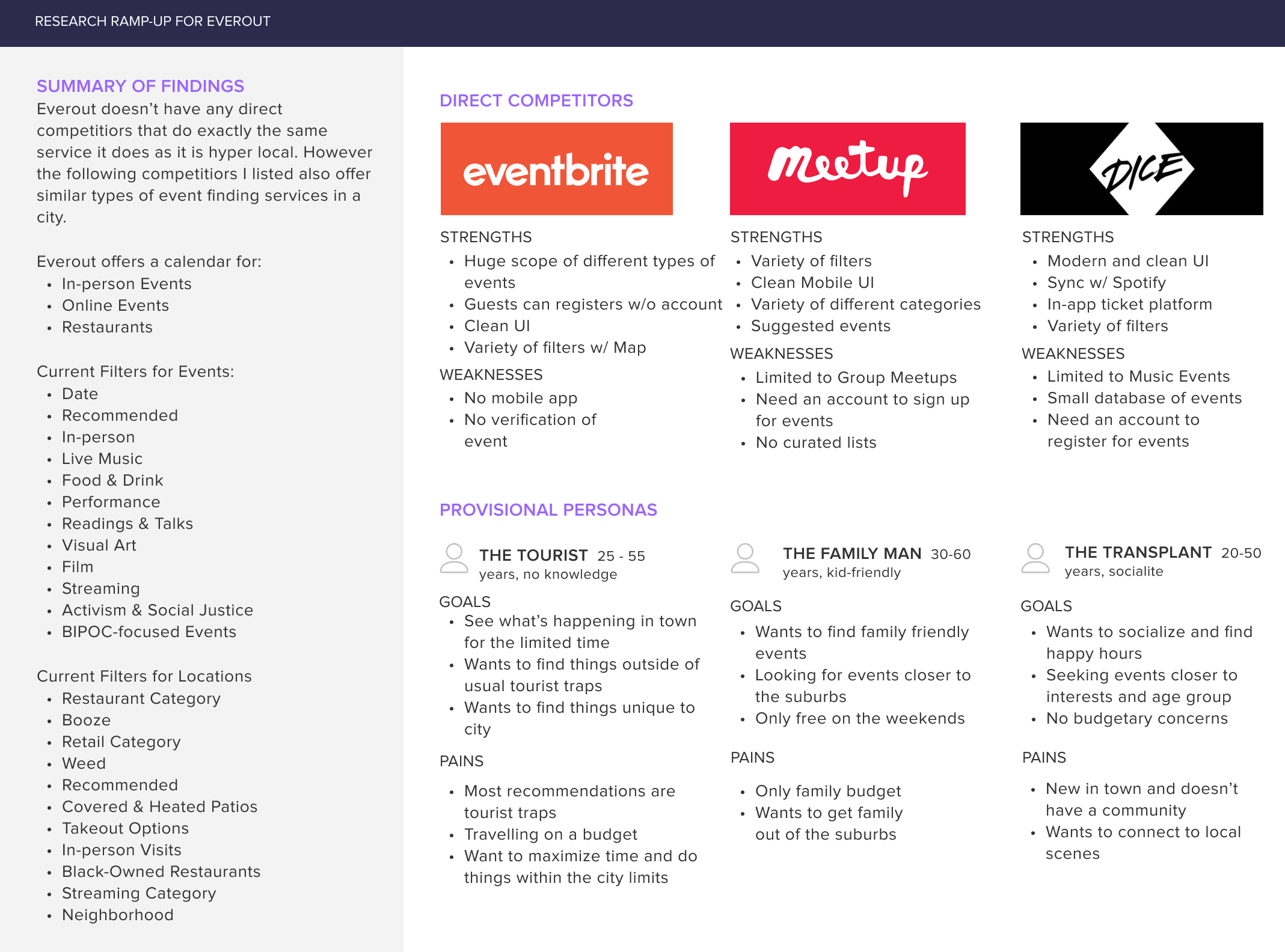
In order to know how EverOut’s current processes for searching, filtering, discovering local Seattle events and locations work for users so that we can translate it into a user-friendly and optimized native mobile application, we conducted both secondary research on the online event discovery space and one on one user interviews of local Seattle-ites and readers of the Stranger to:
- Determine what online features of EverOut are the most helpful and important to users
- Comprehend what information the average user looks for when navigating EverOut
- Understand the user flow of EverOut’s services and mitigate any confusion
Define - Making Event Discovery Easy
To think keep features user-centered, I articulated Problem Statements and How Might We questions (HMW) based on the research. The design was centered around helping users find events catered to their personal interests and locale.
- How might we help both tourists and locals find events happening in Seattle?
- How might we inform new users of the application's features without making it overtly difficult to navigate
- How might we make the discovery process seamless and intuitive for users?
Ideate - Simplifying the Process
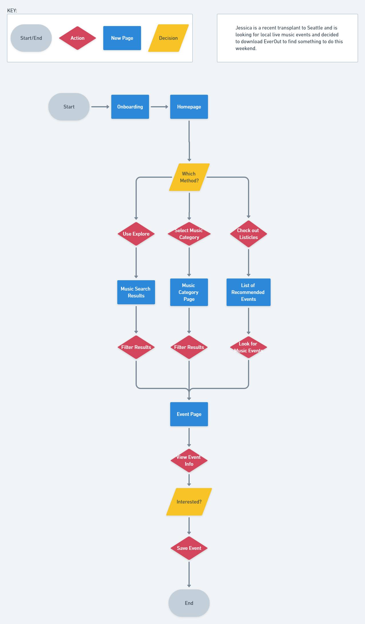
From the user flow, synthesizing the mobile app became a more intuitive approach until we approached a fork in our decision point of whether we should have an account creation feature. This decision was paramount as it set the tone for the rest of the application’s main pages. However we were able to establish a solution by referencing back to the following:
- User research shows that users were more interested in exploring events without creating an account.
- Flow mimics the web-based application’s features of exploring without logging in, making the learning curve easier to understand.
- Everout is a small business and does not have or need the bandwidth to support an account database.
.jpg)
Build - Wireframing & Brand Identity
Once the main skeleton and foundational decisions were made, the wireframes of the in-app experience came together effortlessly. These wireframes displays the base screens that a user would encounter after downloading the iOS application
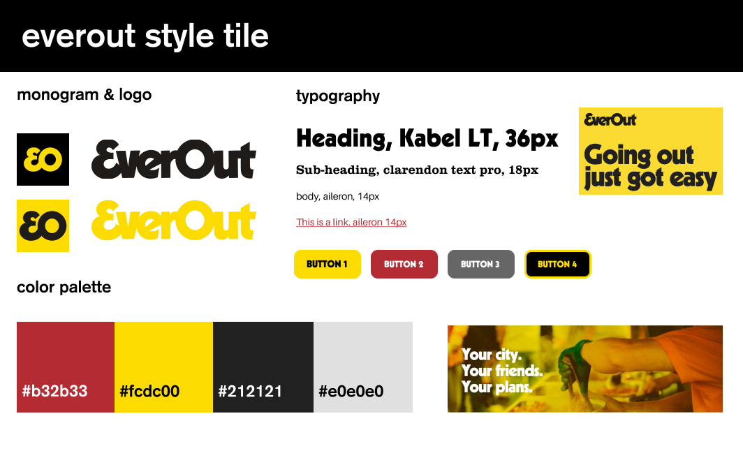
Logo and Style Tile
I wanted to bring out themes I gathered from EverOut's current branding: warmth, modernity, trendy, and memorable style. To bring the user’s familiarity and keep the brand familiarity and reduce user re-learning I expanded on their existing typefaces and color palette while adding various shades of reds, yellows, and greys. The choice of colors is meant to bring about excitement, attention, and importance.
Tutorial Designs
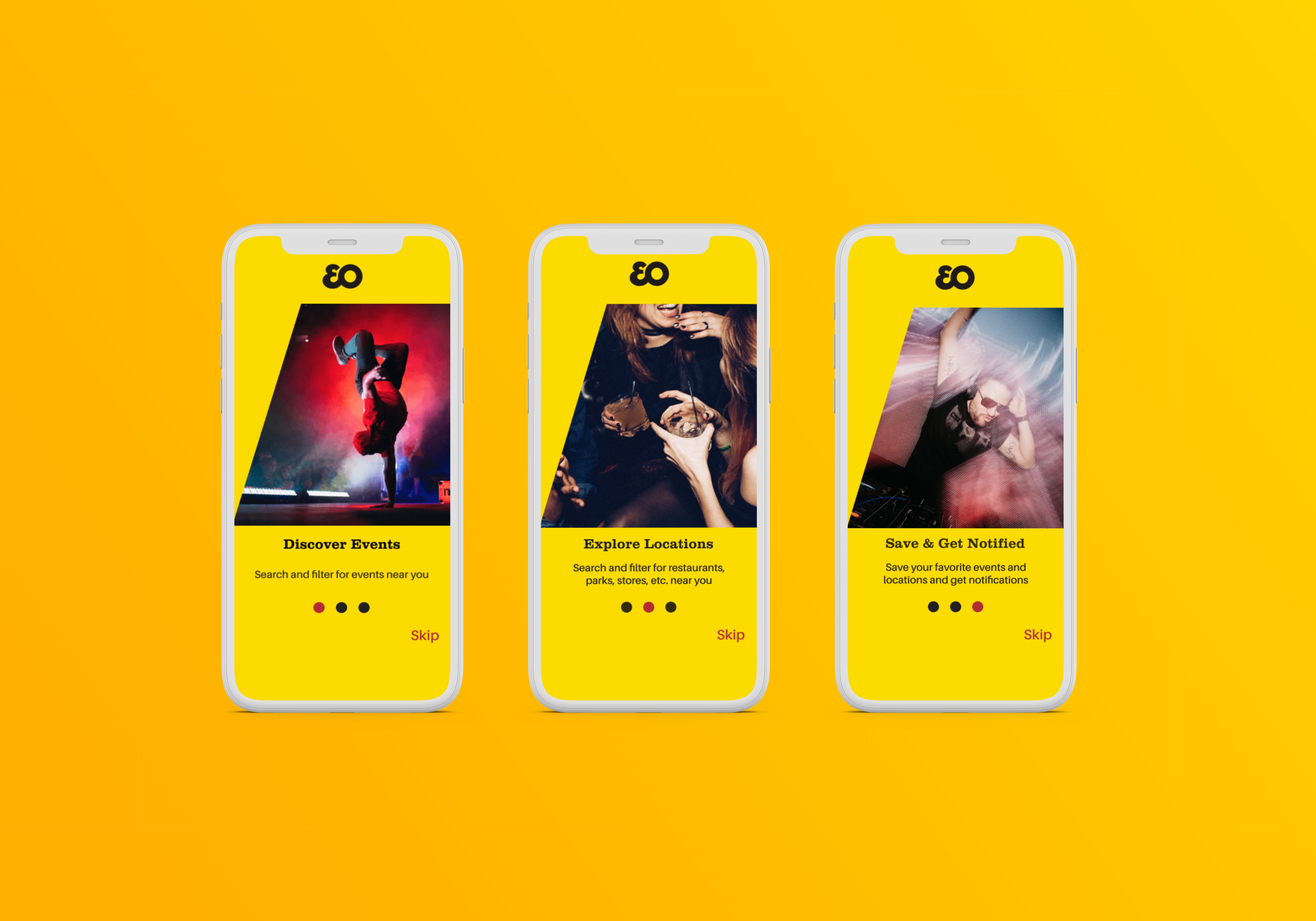
To ease the user into the utility of the application, we introduce them into the various functionalities for any user to grasp with the added option to skip. The three different screens show the tutorial screens by order to show the new user the three main uses of the application.
Core Application Flow
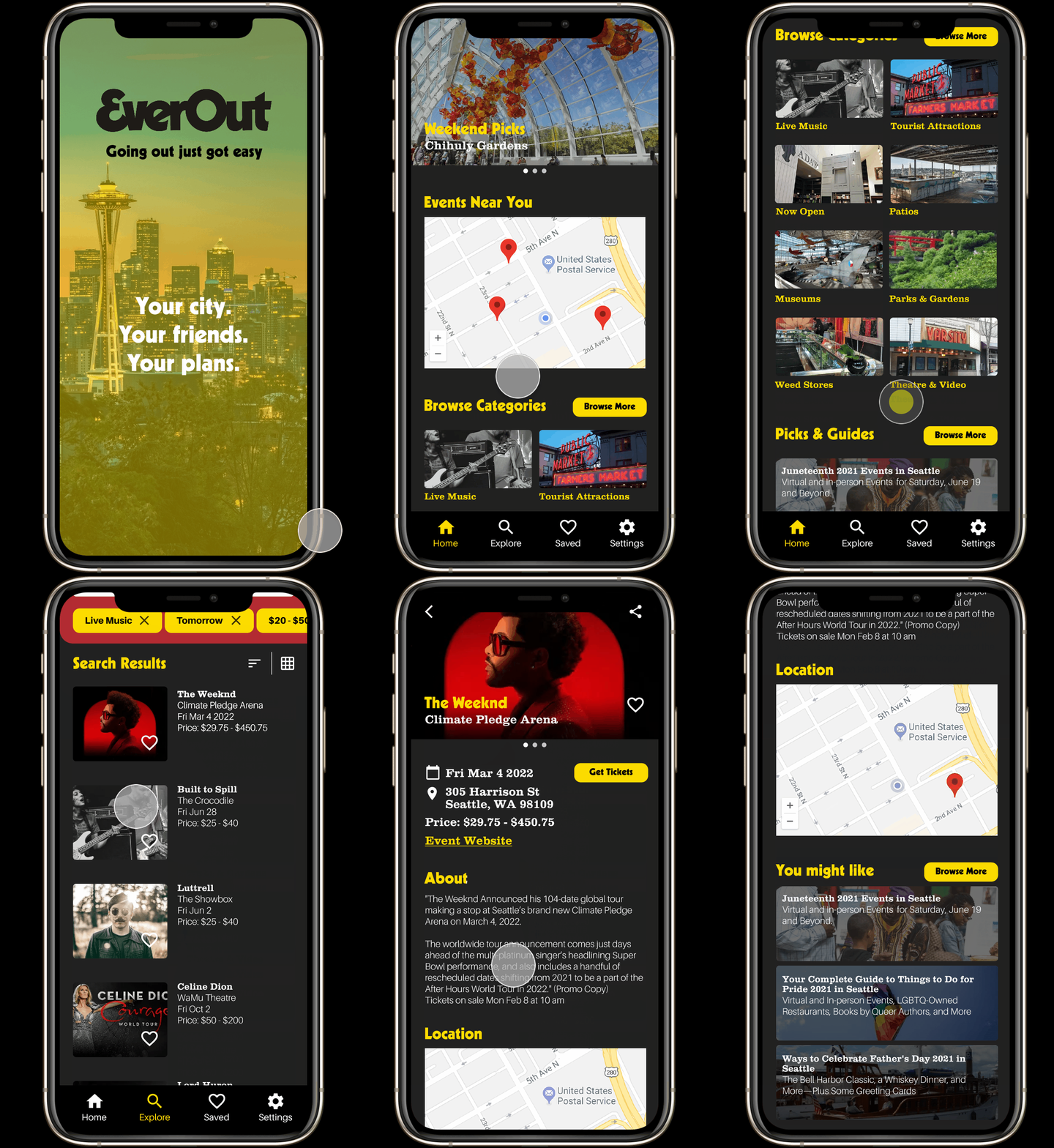
From the POV of a completely new user, the video on the left displays the flow of which a user would go through to find a concert from the splash page to the event detail.
Testing - Revisions & Reflections
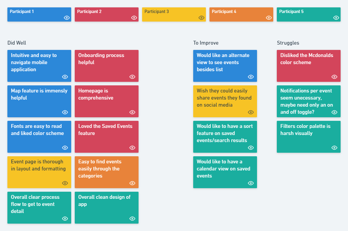
Once I had my high-fidelity prototype working, I recruited 5 participants to test the prototype and observe how they completed each task. From the results and notes I gathered I created an affinity map to prioritize revisions and discover common patterns and pain points. From the affinity map we were able to discover and improve the following revisions:
- Color constrast on the Filters screen is visually harsh
- Option for notifications for all events
- Alternate Calendar view for event results
Key Takeaways & Future Plans
This project helped me understand the design process specific to native mobile applications and utilizing mobile app components and design systems to iOS. I also learned a great deal about working with a fixed company brand and style and collaborating with their print designer.
After implementing changes to alleviate original pain points, I will need to conduct further usability testing and research to uncover additional pain points and make it easy to navigate paths for different tasks. Specifically, I will need to conduct A/B testing to see if users are more familiar with a heart icon or bookmark icon to save items for later.
Future improvements include eventually adding a login/account creation feature, social media integration to see if your friends are also going to similar events, and a modal for sharing events as well.
© Camille Nibungco 2021