Bandcamp – Discovery Feature
Prototyping • Research • Interface
Bandcamp – Adding a Discovery Feature
Bandcamp is an online record store and music community where passionate fans discover, connect with, and directly support the artists they love. Bandcamp’s mission is to help spread the healing power of music by building a community where artists thrive through the direct support of their fans, and where fans gather to explore the amazing musical universe that their direct support helps create.
I took on a UX Design role in this 2 week design sprint to design a fully fleshed out Discovery page feature to increase user engagement. One of Bandcamp's weaker points as a music platform is music discovery, something that other music applications do well because of "The Algorithm" (TM). However Bandcamp tries to mitigate this with quality music journalism through the Bandcamp Daily which has grown significantly in popularity.
Solution & Result
For this project, we are creating a feature on Bandcamp to assist users in discovering new music by aggregating related Bandcamp Daily blog posts into a consolidated Discovery page feature.
Research - Analyzing the Problem Space
Our main research goal is to know how Bandcamp’s current processes for discovering new music works for users through the Bandcamp Daily so that we can translate it into a more user-friendly discovery experience. To remedy these problems we utilized secondary research of the existing site analytics, community mailing surveys, and one on one interviews to:
- Determine what online features of Bandcamp are the most helpful and important to users
- Understand what information the average user looks for when navigating Bandcamp
- Understand the user flow of Bandcamp’s services and mitigate any confusion

Define - Identifying the Scenario
To think keep features user-centered, I articulated Problem Statements and How Might We questions (HMW) based on the research. The design was centered around helping users discover music online.
- How might we engage users to utilize Bandcamp's features discover music?
- How might we avoid algorithmic music discovery while curating the best and new music to users?
- How might we streamline the music discovery process into one main hub?
These questions posit us to narrow down the scope of the project to dedicated Bandcamp users and digital music enthusiasts what align with their ethical goals. Consolidating all of our user research we constructed a Empathy Map to capture these sentiments.


Ideate - Simplifying the Process
I had many ideas of what could be on the website, so I narrowed down the most important features that would make a seamless online experience into the project roadmap. From there, I was inspired by the way news and journalism sites create aggregators for relevant topical information and presenting a vast amount of info in a sensical and logical way that keeps user's engaged.
Thus we decided on creating a fully fleshed out discovery page that would allow genre exploring while also aggregating relevant Bandcamp Daily posts to that genre tag as the user clicks through so that they can find human-curated recommendations. This allows for Bandcamp and user's to both stay true to the mission and values while continuing to support burgeoning artists.
Build - Wireframing & Brand Identity
Through multiple rounds of workshops, UX sketching, and user journey mapping with sticky notes, we identified fundamental issues within the current version of Bandcamp. User pain-points included information overload and no central dashboard to find new music.

Logo & Style Tile
Bandcamp's current style guides and UI is purposefully very minimal and simple to stay true to the DIY ethos and reduce re-learning for users while also allowing for some personalization per artist page. I recreated their style tile on he left to display a visual representation of their brand.

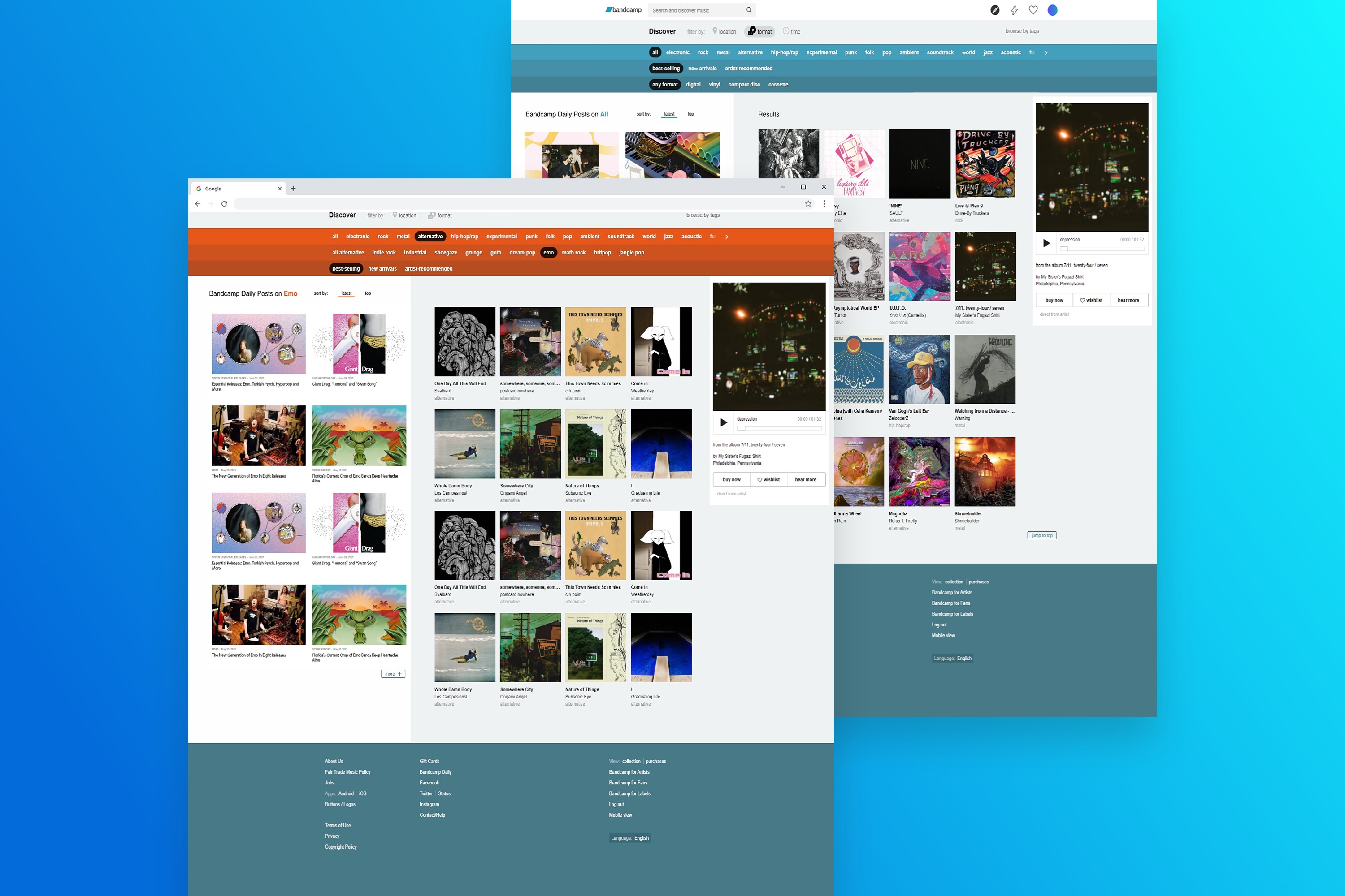
Final Hi-Fidelity UI Screens for various different genres on the Discovery page

Testing - Revisions & Reflections
Once I had my high-fidelity prototype working, I recruited 5 participants to test the prototype and observe how they completed each task. From the results and notes I gathered I created an affinity map to prioritize revisions and discover common patterns and pain points. From the affinity map we were able to discover and improve the following revisions:
- Adding a "Jump to Top Button"
- Queue songs feature
- Save/Bookmark articles to reading list
Key Takeaways & Future Plans
I managed to take Bandcamp's current discovery process, through the homepage and create a feature that would ideally bring more user engagement and interfacing with their blog site, the Daily, as well. This project is something I would personally use as an avid Bandcamp user and enthusiast and hopefully othere would find it useful as well.
Future improvements to the Discovery feature would to find a way to introduce this into the mobile application or redefine the way the genre filtering is currently searched by. This would make exploring the site more intuitive if it worked more like a feed.
© Camille Nibungco 2021